Tradurre visivamente l’intraducibile
Tra il linguaggio visuale e quello di un large language model (quello su cui è stata costruita l’AI così come la conosciamo noi oggi) esiste una parentela che non è immediatamente visibile, ma che diventa evidente non appena si smette di pensare alle parole come entità “naturali” e si comincia a osservarle per ciò che sono davvero: costrutti, aggregati di segni, relazioni, intensità, contesti.
Between visual language and that of a large language model (the one upon which AI as we know it today is built) there exists a kinship that is not immediately visible, but becomes evident as soon as one stops thinking of words as "natural" entities and begins to observe them for what they truly are: constructs, aggregates of signs, relationships, intensities, contexts.
An LLM doesn't "understand" a word because it knows it, but because it places it in a space of relationships, a latent space made of proximity, distance, statistical weight, semantic resonances. Similarly, visual language doesn't communicate because it represents, but because it organizes differences, perceptual hierarchies. In both cases, meaning doesn't lie in the minimal unit – the word, the sign, the color – but in the system that holds them together.
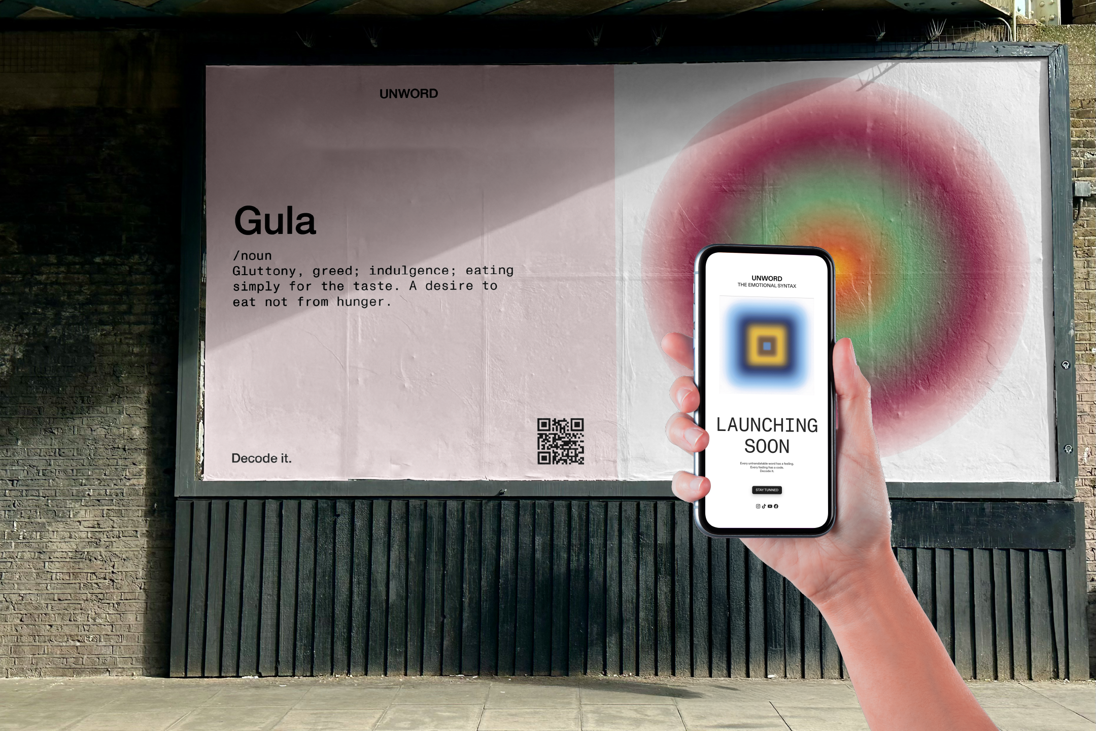
The project we're discussing here was born exactly in this border zone. Jimena Blanco Quiroga, in her thesis UNWORD, tried to do something that surprisingly resembles (in an instinctive way, without realizing it) what contemporary language models do, while starting from an apparently opposite territory: creativity, design, perception. She took untranslatable words – those that resist literal translation because they are dense with culture, memory, lived experience – and chose not to "explain" them, but to recode them: not into another language, but into a visual system. She used shapes, axes, colors, intensities, contexts: variables that, when combined, produce a synthesis-image capable of evoking a sensation even before defining it. Not a translation, but a transposition.
This is where semiotics comes into play, even when it's never named. Every human being is programmed – biologically, culturally, historically – to seek meaning in what they see. Vision is never neutral: it's interpretation, it's projection, it's memory that activates. A color is never just a color, a shape is never just a shape. Visual design has always worked on this ambiguous terrain, where the sign becomes message and the message becomes emotion. The science of language models, through completely different paths, arrives at a surprisingly similar conclusion: even for a machine, meaning is not an absolute given, but a configuration. A pattern that emerges from a multitude of parameters.
However, there's an important difference and in some ways one capable of leading to an interesting conjunction between these two worlds: emotions, sensations, human experience are distant from science in their manifestation, but they need codes to be transmitted. Without a form, without a structure, they remain private, untranslatable, inaccessible. Visual design builds these codes starting from intuition, sensitivity, culture. Language models build them starting from data, recurrences, probabilities. Yet, when both must "approach" the human, or perhaps, more honestly, when we try to approach them, the problem becomes the same: how to give form to what is not easy to say.
UNWORD tentatively tries to enter this intermediate space: not only as a theoretical exercise, but as a possible concrete system, an attempt to demonstrate that visual language can function as a semantic infrastructure, no less rigorous than the computational one, and that the distance between creativity and science is much thinner than we're used to thinking. Perhaps it's precisely in this convergence – between encoding and intuition, between form and meaning, between human and machine – that one of the most interesting games of our present is being played. Not to make machines more "human" in a naive sense, but to build systems that know how to accommodate the complexity of meaning without reducing it, and that remind us that every language, before being understood, must be designed. And precisely based on this initial intuition, we decided as Aiway Magazine to interpret this project born within pure design and not "science," and to bring it into an AI path, analyzing the structure and then developing a programming project in collaboration with a Vibe Coding platform, with which we arrived at a result that demonstrates that the two paths not only can be parallel but indeed converge, transforming hypotheses into reality, and projects into (potential) products. If on one hand there was imagination, today we have a system that, although in prototype form, not only confirms the theory expressed, but makes it real, both in the word analysis phase (which is no longer just one, but infinite, because a way has been found to approach decoding in a general and not specific way for each word) and also the ability to "read" a form and define its meaning (once again, semiotics reappearing).
Below, we interviewed the student and invite you to experiment with the prototype that, as Aiway Magazine, we developed based on her research.
Tell us about your background and how you arrived at communication design?
Jimena: "I have a background in UI/UX (user interface and user experience), I studied in Barcelona at Elisava, a design school. And then, after that, I did a specialization in graphic design. When I moved here to Milan, I already knew in a way that wasn't my path, I'm not that passionate about UI/UX. So I decided to study communication, and then I realized I'm good at it and I really like it."
What was the personal motivation or 'spark' behind the 'UNWORD' project?
Jimena: "It was partly because of a question I always ask myself since I come from Spain. I always say that English is for stupid people. Obviously, it's not for stupid people, but in a way it is because it's a very simple way to describe a lot of things, and it's crazy how it's our default language internationally. It's super practical, but then a lot of things get lost in meaning. And so the idea was born from this way I always talk with my friends in an international context: there are many things I can't express, because I use Spanish expressions every time I speak, which I bet you also do in Italian."
How did you move forward in your initial research?
Jimena: "I started analyzing different campaigns that hadn't worked due to translation errors, because they didn't reach the right market they were trying to target. Campaigns from here to China, on which I did quite a bit of research to lay the foundation for my thesis."
In what way did psychology influence your research?
Jimena: "During all this research, I discovered I'm very passionate about psychology in general. I wanted to identify how perception and memory can influence people's behavioral aspect and the interpretation of concepts. And so I asked myself if there could be a way or if I could create a sort of international system, not a language, but a system that would allow everyone to understand that feeling that you won't understand unless you're part of that culture or context. And since I'm a very 'visual' person, I said to myself: let's try to find variables to make this happen."
Who is Tim Lomas and how did he influence the structure of your thesis?
Jimena: "He's an English linguist and psychologist who found 216 words that in a way are not translatable: unless you're from that culture, there's no real correspondence. Because in the end you can translate everything, right? But you have to explain what the word is. There's no real translation. So he found 216 words and obviously I immersed myself in them and explored those I found most interesting. First I made a selection of 40 and, from that selection, I went down to 18."
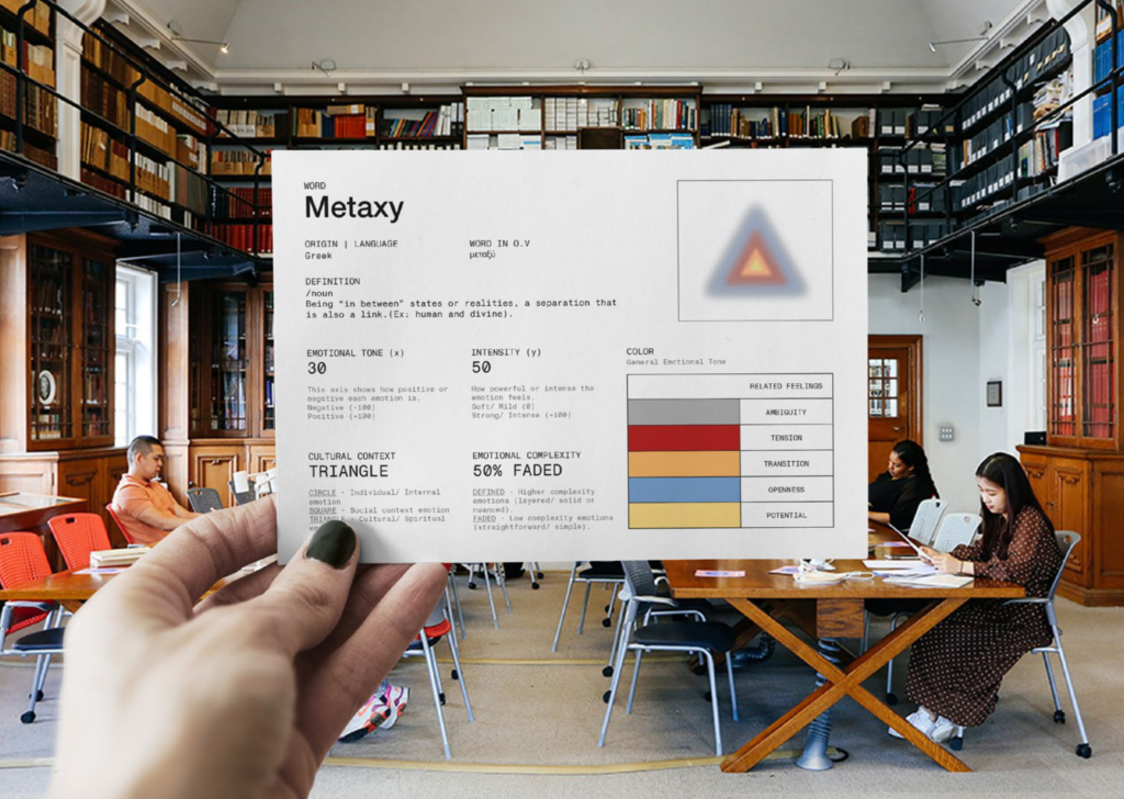
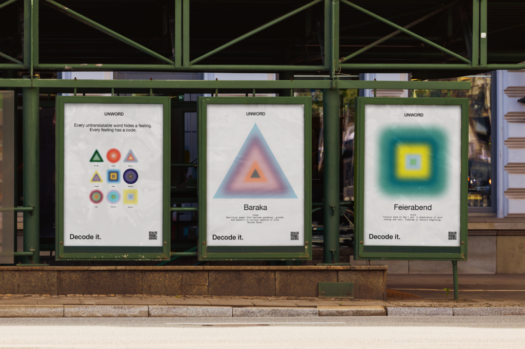
Can you explain the 'technical sheet' and the variables you used to map these words?
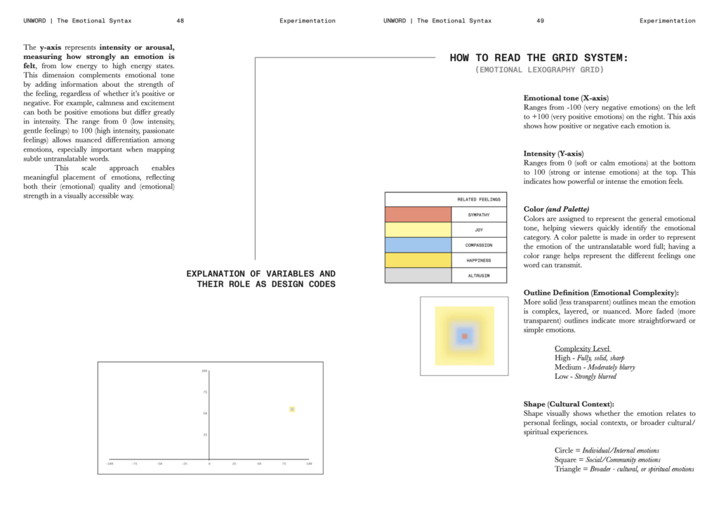
Jimena: "The technical sheet is the graphic system, in which there's the complete overview of the word, or rather the 'non-word,' as I called it. You have the pixel, so the shape that represents that word, and its position in the graph represents what the emotion means. The X-axis represents how positive or negative that emotion is, while the Y-axis is the intensity (whether you feel it strongly or not)."
What is the meaning of the different shapes, like circles, squares and triangles?
Jimena: "The shape concerns its cultural context. If it's a word related to spirituality, maybe coming from a country very connected to the religious and spiritual dimension, or if it concerns a feeling you experience alone or concerns more the context. There are three different shapes: the square, the circle and the triangle."
How do you visually represent the 'depth' or complexity of an emotion?
Jimena: "For emotional complexity, there are two types of variables: if it's more blurred or if it's very defined. Something blurred is very simple to understand, it doesn't have many layers, while something very defined has many layers and is more complicated to interpret. This is basically the general framework of the variables plus color."
Why did you choose color as a variable and how did you decide on the combinations?
Jimena: "Since there's no appropriate way to describe these words, the easiest way was through color psychology, since there are already certain associated meanings. Desire is seen mainly as red, in this case it's a bit darker because it's not, for example, linked to the concept of euphoria. Obviously these were touched up a bit, because at the end of the day they're the result of my interpretation: there's not just a lot of research, but also my vision. Then I also implemented the three groups into which Tim Lomas divided his words, so you understand if it concerns a personal sensation or a relationship. Everything has its place. To understand the word you need the definition, the context and the language."
Was there a moment in your journey when you realized that design and graphics could be a new language to use to express yourself?
Jimena: "Definitely. I consider myself very creative in general. If there's a problem I'll probably approach it from a graphic and design point of view. When I was tackling all this research on how to get from 'English is for stupid people' to creating a design system, honestly I woke up one day and said to myself: yes, let's just find some variables and do it visually. For me it's easier to understand if it's visual. I had to do it for myself, to understand the context of these words, and I wanted others to understand it too."
You talked about a 'design system': in what way did your UI/UX training influence the structure of this project?
Jimena: "The UI/UX approach offers a lot of order and is very schematic. It helped me understand that, like in a design system, you have your typography and your colors, here I could do the same. I analyzed each variable on its own and then used a combination of them. At first everything worked without the grid, then I said to myself: I have to explain the grid because it will be able to explain everything in a single image. Even though I didn't continue in that academic field, my training definitely helped me a lot. Today I work as a freelancer also in UI/UX and having that background helps you see things differently."
Did you ever realize you were creating something very similar to a computational language (even if you weren't 'programming,' in a literal sense)?
Jimena: "I hadn't really thought about it. But if I see the project from this perspective, it's an example of how science meets design. You can see it as the idea behind an AI model, but it wasn't the initial idea, or at least I don't see it that way because I'm very immersed in the concept. But maybe a person who sees it now for the first time could understand it even better if it were enhanced by something else."
Did you use Artificial Intelligence in your research or design process?
Jimena: "I used AI for research, for example to identify color psychology books. I mainly used Google Gemini. My personal point of view is that AI is super useful, but it shouldn't do the work for you. Nowadays in my generation a lot of people delegate everything to it. For me it doesn't work like that. It's a tool: without it my thesis would have required much more time. It helped me identify concepts. I asked the chatbot some questions, for example: 'I know these colors are the correct ones for psychology, but is it okay if I change them?'. And the chat responded: 'it depends if you want to make it more personal or more science-based'. So it depends on how you want to focus the project and it's up to you to make choices."
How does your system work concretely for those who consult it?
Jimena: "The entire platform is based on the definitions that Lomas created. After my research I also relied on other books because I wanted to compare or even ask people from various countries how they would define those words. On the left side there are the different themes, in the center the definitions (which reorder when you search for a feeling) and on the right side the language. You can search through different filters. Once you immerse yourself in the system it's easier to understand. And I feel that now, with this created foundation, it could scale to all 216 words since there's already a guide."
The way you mapped content and encoded words according to various parameters is very similar to how LLMs (large language models) work. Each element (whether it's a subject, an object, a word) is defined according to various parameters, such as shape, color, function, name, etc. This information, given to the model in the training phase, constitutes the latent space that the AI draws upon in response to our request. This made us think that, obviously, it's humanly difficult and time-consuming to encode and design this classification on 18, 40, 216 words... for a machine it would be simpler and more scalable, and one could think of expanding this tool to many more words, languages, cultures: we often talk about AI to create new things, but there are languages in the world that are disappearing and that could be conserved and preserved, as well as transmitted, through the use of artificial intelligence (we have for example already talked about various projects, including one dedicated to the Sardinian language).
This discussion touches me very personally. I'm Spanish, but also Catalan. I've seen my language being erased all these years due to tourism and ignorance. What you were saying about preserving certain languages triggered something with Catalan. In the project, in fact, I wanted to include not only Spanish, but words I could understand like Saudade or others. I don't have any in Italian, I simply didn't do it, but I wanted to make it as international as possible. There are Asian words, Indian, in Sanskrit... a bit of everything.
Based on this stimulus and parallelism, we did a small limited test, to show the potential of a good idea - Jimena's - combined with those of AI: through vibecoding, we built a platform starting from your thesis research.
We invite you to take a tour and try this platform, still in more than beta version: we hope it stimulates your creativity, just as getting to know Jimena's project did with us. It's an invitation to never forget that a good idea can benefit from artificial intelligence to be "augmented" and made, for example, accessible to more people, but never totally replaced by it. Project ideated, created, curated, and developed by: Jimena Blanco Quiroga Digital prototyping and AI: an Aiway Magazine project × Jimena Blanco Quiroga
Un LLM non “capisce” una parola perché la conosce, ma perché la colloca in uno spazio di relazioni, uno spazio latente fatto di prossimità, distanza, peso statistico, risonanze semantiche. Allo stesso modo, il linguaggio visuale non comunica perché rappresenta, ma perché organizza differenze, gerarchie percettive. In entrambi i casi, il senso non sta nell’unità minima – la parola, il segno, il colore – ma nel sistema che li tiene insieme.
Il progetto che raccontiamo qui nasce esattamente in questa zona di confine. Jimena Blanco Quiroga, nella sua tesi UNWORD, ha provato a fare qualcosa che assomiglia sorprendentemente (in modo istintivo, senza accorgersene) a ciò che fanno i modelli linguistici contemporanei, pur partendo da un territorio apparentemente opposto: la creatività, il design, la percezione. Ha preso parole intraducibili – quelle che resistono alla traduzione letterale perché sono dense di cultura, memoria, vissuto – e ha scelto di non “spiegarle”, ma di ricodificarle: non in un’altra lingua, ma in un sistema visuale. Ha usato forme, assi, colori, intensità, contesti: variabili che, combinate, producono un’immagine-sintesi capace di evocare una sensazione prima ancora di definirla. Non una traduzione, ma una trasposizione.
Qui entra in gioco la semiotica, anche quando non viene mai nominata, ogni essere umano è programmato – biologicamente, culturalmente, storicamente – per cercare senso in ciò che vede. La visione non è mai neutra: è interpretazione, è proiezione, è memoria che si attiva, un colore non è mai solo un colore, una forma non è mai solo una forma. Il visual design lavora da sempre su questo terreno ambiguo, dove il segno diventa messaggio e il messaggio diventa emozione. La scienza dei modelli linguistici, per vie completamente diverse, arriva a una conclusione sorprendentemente simile: anche per una macchina il significato non è un dato assoluto, ma una configurazione. Un pattern che emerge da una moltitudine di parametri.
C’è però una differenza importante e per certi versi capace di portare ad una congiunzione interessante tra questi due mondi: le emozioni, le sensazioni, l’esperienza umana sono lontane dalla scienza nel loro manifestarsi, ma hanno bisogno di codici per essere trasmesse. Senza una forma, senza una struttura, restano private, intraducibili, inaccessibili. Il design visuale costruisce questi codici a partire dall’intuizione, dalla sensibilità, dalla cultura. I modelli linguistici li costruiscono a partire dai dati, dalle ricorrenze, dalle probabilità. Eppure, nel momento in cui entrambi devono “avvicinarsi” all’umano, o forse, più onestamente, nel momento in cui noi proviamo ad avvicinarci a loro, il problema diventa lo stesso: come dare forma a ciò che non è facile da dire.
UNWORD prova ad entrare timidamente in questo spazio intermedio: non solo come un esercizio teorico, ma come un possibile sistema concreto, un tentativo di dimostrare che il linguaggio visuale può funzionare come un’infrastruttura semantica, non meno rigorosa di quella computazionale, e che la distanza tra creatività e scienza è molto più sottile di quanto siamo abituati a pensare. Forse è proprio in questa convergenza – tra codifica e intuizione, tra forma e significato, tra umano e macchina – che si gioca una delle partite più interessanti del nostro presente. Non per rendere le macchine più “umane” in senso ingenuo, ma per costruire sistemi che sappiano accogliere la complessità del senso senza ridurla, e che ci ricordino che ogni linguaggio, prima di essere compreso, deve essere progettato.
E proprio sulla base di questa intuizione iniziale, abbiamo deciso come Aiway Magazine di interpretare questo progetto nato all’interno del puro design e non della “scienza”, e di farlo entrare in un percorso AI, analizzando la struttura e poi sviluppando un progetto di programmazione in collaborazione con una piattaforma di Vibe Coding, con cui siamo arrivati ad un risultato che dimostra che le due strade non solo possono essere parallele ma anzi convergono, trasformando ipotesi in realtà, e progetti in (potenziali) prodotti. Se da un lato c’è stata immaginazione, oggi abbiamo un sistema, che pur in forma prototipale, non solo conferma la teoria espressa, ma la rende reale, sia in fase di analisi della parola (che non è più una sola, ma infinite, perché è stato trovato il modo per affrontare la decodifica in modo generale e non specifico su ogni parola) ma anche la capacità di “leggere” una forma e definirne il significato (ancora una volta, la semiotica che ricompare).
Qui di seguito, abbiamo intervistato la studentessa e vi proponiamo di sperimentare il prototipo che, come Aiway Magazine, abbiamo sviluppato sulla base della sua ricerca.
Raccontaci del tuo background e di come sei arrivata al design della comunicazione?
Jimena: “Ho un background in UI/UX (user interface e user experience), ho studiato a Barcellona all’Elisava, una scuola di design. E poi, dopo quello, ho fatto una specializzazione in graphic design. Quando mi sono trasferita qui a Milano, sapevo già in un certo senso che quella non era la mia strada, non sono poi così appassionata di UI/UX. Quindi ho deciso di studiare comunicazione, e poi ho capito di saperlo fare bene e che mi piace molto.
Qual è stata la motivazione personale o la “scintilla” dietro il progetto “UNWORD”?
Jimena: “È stato un po’ per via di una domanda che mi pongo sempre dato che vengo dalla Spagna. Dico sempre che l’inglese è per persone stupide. Ovviamente, non è per persone stupide, ma in un certo senso lo è perché è un modo molto semplice per descrivere un sacco di cose, ed è pazzesco come sia la nostra lingua predefinita a livello internazionale. È super pratico, ma poi un sacco di cose si perdono nel significato. E quindi l’idea è nata da questo modo in cui parlo sempre con i miei amici in un contesto internazionale: ci sono molte cose che non riesco a esprimere, perché uso espressioni spagnole ogni volta che parlo, cosa che scommetto fate anche voi in italiano.
Come ti sei mossa, quindi, nella tua ricerca iniziale?
Jimena: “Ho iniziato un po’ ad analizzare diverse campagne che non avevano funzionato a causa di errori di traduzione, perché non arrivavano al mercato giusto a cui cercavano di rivolgersi. Campagne da qui alla Cina, su cui ho fatto parecchia ricerca per gettare le basi della mia tesi.
In che modo la psicologia ha influenzato la tua ricerca?
Jimena: “Durante tutta questa ricerca, mi sono scoperta molto appassionata di psicologia in generale. Volevo identificare come percezione e memoria possano influenzare l’aspetto comportamentale delle persone e l’interpretazione dei concetti. E così mi sono chiesta se ci potesse essere un modo o se potessi creare io una sorta di sistema internazionale, non una lingua, ma un sistema che permettesse a tutti di capire quella sensazione che non capirai a meno che tu non faccia parte di quella cultura o di quel contesto. E dato che sono una persona molto “visiva” mi sono detta: proviamo a trovare delle variabili per far sì che questo accada.
Chi è Tim Lomas e come ha influenzato la struttura della tua tesi?
Jimena: “È un linguista e psicologo inglese che ha trovato 216 parole che in un certo senso non sono traducibili: a meno che tu non sia di quella cultura, non c’è una vera corrispondenza. Perché alla fine puoi tradurre tutto, no? Ma devi spiegare cos’è la parola. Non c’è una traduzione vera e propria. Quindi ha trovato 216 parole e ovviamente mi ci sono immersa e ho esplorato quelle che trovavo più interessanti. Prima ho fatto una selezione di 40 e, da quella selezione, sono scesa a 18.
Puoi spiegarci la “scheda tecnica” e le variabili che hai usato per mappare queste parole?
Jimena: “La scheda tecnica è il sistema a grafici, in cui c’è la panoramica completa della parola, anzi la ‘non parola’, come l’ho chiamata. Hai il pixel, quindi la forma che rappresenta quella parola, e la sua posizione nel grafico rappresenta ciò che l’emozione significa. L’asse X rappresenta quanto positiva o negativa sia quell’emozione, invece l’asse Y è l’intensità (se la senti molto o no).
Qual è il significato delle diverse forme, come cerchi, quadrati e triangoli?
Jimena: “La forma riguarda il suo contesto culturale. Se è una parola legata alla spiritualità, magari proveniente da un Paese molto legato alla dimensione religiosa e spirituale, oppure se riguarda un sentimento che provi da solo oppure riguarda più il contesto. Ci sono tre forme diverse: il quadrato, il cerchio e il triangolo.
Come rappresenti visivamente la “profondità” o la complessità di un’emozione?
Jimena: “Per la complessità emotiva, ci sono due tipi di variabili: se è più sfumata o se è molto delineata. Qualcosa di sfumato è molto semplice da capire, non ha molti strati, mentre quella molto definita ha molti strati ed è più complicata da interpretare. Questo è fondamentalmente il quadro generale delle variabili più il colore.
Perché hai scelto il colore come variabile e come hai deciso gli abbinamenti?
Jimena: “Dato che non c’è un modo appropriato per descrivere queste parole, il modo più facile è stato attraverso la psicologia del colore, dato che ci sono già certi significati associati. Il desiderio è visto principalmente come rosso, in questo caso è un po’ più scuro perché non è, ad esempio, legato al concetto di euforia. Ovviamente questi sono stati ritoccati un po’, perché alla fine dei conti sono frutto dalla mia interpretazione: non c’è solo molta ricerca, ma anche la mia visione. Poi ho implementato anche i tre gruppi in cui Tim Lomas ha diviso le sue parole, così capisci se riguarda una sensazione personale o una relazione. Ogni cosa ha il suo posto. Per capire la parola devi avere la definizione, il contesto e la lingua.
C’è stato un momento nel tuo percorso in cui hai capito che il design e la grafica potessero essere un nuovo linguaggio da usare per esprimerti?
Jimena: “Di sicuro. Mi considero molto creativa in generale. Se c’è un problema lo affronterò probabilmente da un punto di vista grafico e di design. Quando stavo affrontando tutta questa ricerca su come arrivare da ‘l’inglese è per persone stupide’ a creare un design system, onestamente mi sono svegliata un giorno e mi sono detta: sì, troviamo solo alcune variabili e facciamolo visivamente. Per me è più facile da capire se è visivo. Ho dovuto farlo per me, per capire il contesto di queste parole, e volevo che lo capissero anche gli altri.
Hai parlato di “design system”: in che modo la tua formazione in UI/UX ha influenzato la struttura di questo progetto?
Jimena: “L’approccio UI/UX offre molto ordine ed è molto schematico. Mi ha aiutato a capire che, come in un design system, hai la tua tipografia e i tuoi colori, qui potevo fare lo stesso. Ho analizzato ogni variabile per conto suo e poi ho usato una combinazione di esse. All’inizio funzionava tutto senza la griglia, poi mi sono detta: devo spiegare la griglia perché sarà in grado di spiegare tutto in una sola immagine. Anche se non ho proseguito in quel campo accademico, sicuramente la mia formazione mi ha aiutato molto. Oggi lavoro come freelance anche in UI/UX e avere quel background ti aiuta a vedere le cose in modo diverso.
Ti sei mai accorta che stavi creando qualcosa di molto simile a un linguaggio computazionale (anche se non stavi “programmando”, in senso letterale)?
Jimena: “Non ci avevo proprio pensato. Ma se vedo il progetto da questa prospettiva, è un esempio di come la scienza incontra il design. Puoi vederlo come l’idea alla base di un modello AI, ma non era l’idea iniziale, o almeno io non lo vedo così perché sono molto immersa nel concetto. Ma forse una persona che lo vede ora per la prima volta potrebbe capirlo ancora meglio se fosse potenziato da qualcos’altro.
Hai usato l’Intelligenza Artificiale nel tuo processo di ricerca o progettazione?
Jimena: “Ho usato l’AI per la ricerca, ad esempio per identificare i libri di psicologia del colore. Ho usato soprattutto Google Gemini. Il mio punto di vista personale è che l’AI sia super utile, ma non deve fare il lavoro al posto tuo. Al giorno d’oggi nella mia generazione un sacco di persone delegano tutto ad essa. Per me non funziona così. È uno strumento: senza di quello la mia tesi avrebbe richiesto molto più tempo. Mi ha aiutata a identificare i concetti. Ho fatto alcune domande al chat bot, ad esempio: ‘so che questi colori sono quelli corretti per la psicologia, ma va bene se li cambio?’. E la chat ha risposto: ‘dipende se vuoi renderlo più personale o più basato sulla scienza’. Quindi dipende da come vuoi focalizzare il progetto e sta a te fare delle scelte.
Come funziona concretamente il tuo sistema, per chi lo consulta?
Jimena: “L’intera piattaforma si basa sulle definizioni che Lomas ha creato. Dopo la mia ricerca mi sono affidata anche ad altri libri perché volevo confrontare o persino chiedere alle persone di vari Paesi come definirebbero quelle parole. Sul lato sinistro ci sono i diversi temi, al centro le definizioni (che si riordinano quando cerchi una sensazione) e sul lato destro la lingua. Puoi cercare tramite diversi filtri. Una volta che ti immergi nel sistema è più facile da capire. E sento che ora, con questa base creata, si potrebbe scalare a tutte le 216 parole dato che c’è già una guida.
Il modo in cui hai mappato i contenuti e codificato le parole secondo vari parametri è molto simile al modo in cui lavorano gli LLM (large language models). Ogni elemento (che sia un soggetto, un oggetto, una parola) è definito secondo vari parametri, come forma, colore, funzione, nome, eccetera. Queste informazioni, date al modello nella fase di training, vanno a costituire lo spazio latente a cui l’AI attinge a fronte poi di una nostra richiesta. Questo ci ha fatto pensare che, ovviamente, è umanamente difficile e richiede molto tempo codificare e progettare questa classificazione su 18, 40, 216 parole… per una macchina sarebbe più semplice e scalabile, e si potrebbe pensare di ampliare questo strumento a molte più parole, lingue, culture: si parla spesso di AI per creare cose nuove, ma ci sono lingue che nel mondo stanno sparendo e che si potrebbero conservare e preservare, oltre che trasmettere, attraverso l’uso dell’intelligenza artificiale (abbiamo per esempio già parlato di vari progetti, tra cui uno dedicato alla lingua sarda).
Questo discorso mi tocca molto personalmente. Sono spagnola, ma anche catalana. Ho visto la mia lingua venire cancellata in tutti questi anni a causa del turismo e ignoranza. Quello che dicevi riguardo al preservare certe lingue ha fatto scattare qualcosa con il catalano. Nel progetto, infatti, volevo inserire non solo lo spagnolo, ma parole che potevo capire come Saudade o altro. Non ne ho nessuna in italiano, semplicemente non l’ho fatto, ma volevo renderlo il più internazionale possibile. Ci sono parole asiatiche, indiane, in sanscrito… un po’ di tutto.
Sulla base di questo stimolo e parallelismo, abbiamo fatto un piccolo test limitato, per mostrare le potenzialità di una buona idea – quella di Jimena – unita a quelle dell’AI: tramite vibecoding, abbiamo costruito una piattaforma a partire dalla tua ricerca di tesi.
Cliccate qui per accedere al prototipo interattivo, sviluppato da Aiway Magazine × Jimena Blanco Quiroga
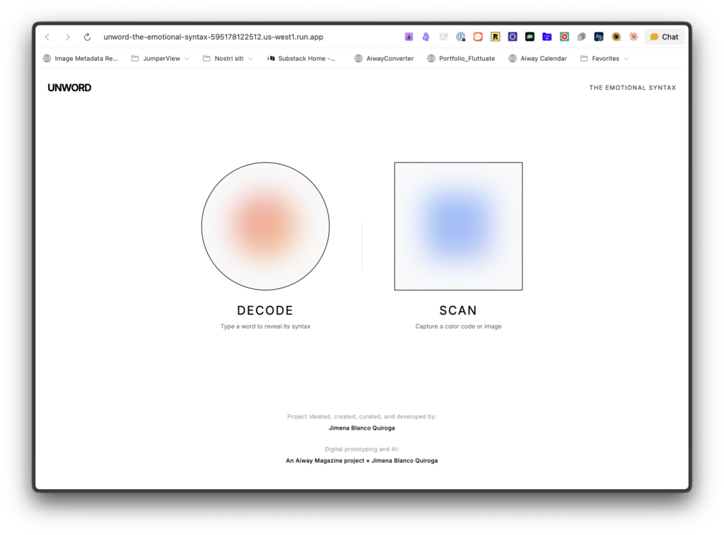
Qui sotto un video che mostra il funzionamento da computer dell’App, selezionando 4 parole particolarmente care alla redazione. Come potete vedere, il funzionamento via LLM permette di scegliere e visualizzare qualsiasi parola di qualsiasi lingua del mondo.
Le parole scelte sono queste:
1. Saudade (portoghese) – Una nostalgia malinconica mista a desiderio per qualcosa o qualcuno che probabilmente non tornerà. Non è solo “nostalgia” – è più profonda, più dolce-amara, quasi una presenza fisica nel petto.
2. Hygge (danese) – Quell’atmosfera accogliente e intima che ti avvolge quando sei al caldo con persone care, magari con candele accese in una sera d’inverno. “Intimità accogliente” non rende giustizia a questo concetto che è quasi una filosofia di vita.
3. Mamihlapinatapai (yaghan, lingua della Terra del Fuoco) – Quello sguardo tra due persone quando entrambe vogliono qualcosa ma nessuna inizia. Un momento sospeso di desiderio condiviso e timidezza reciproca. Intraducibile al punto che serve un’intera frase per spiegarla.
4. Komorebi (giapponese, 木漏れ日) – La luce del sole che filtra tra le foglie degli alberi. I giapponesi hanno creato una parola specifica per questo gioco di luce e ombra, trasformando un fenomeno visivo in poesia.
Vi invitiamo a fare un giro e provare questa piattaforma, ancora in versione più che beta: speriamo stimoli la vostra creatività, così come conoscere il progetto di Jimena ha fatto con noi. È un invito a non dimenticare mai che una buona idea può beneficiare dell’intelligenza artificiale per essere “aumentata” e resa, per esempio, fruibile da più persone, ma mai da essa totalmente sostituita.
Project ideated, created, curated, and developed by: Jimena Blanco Quiroga
Digital prototyping and AI: an Aiway Magazine project × Jimena Blanco Quiroga
Related Posts

Editoriale
Leggi subito, gratis, il primo editoriale di Aiway. Buona lettura!
Cercasi stile creativamente
Gli SRef di Midjourney sono uno strumento utile di esplorazione creativa, e non è quindi un caso che continuano ad evolversi: ecco le ultime novità
Editoriale
L'Editoriale di Aiway 2 è gratis per tutti: leggilo e scopri perché abbiamo dedicato tutto il numero a quello che abbiamo definito: L’era della Simbiosi

Prompt un po’ come ti pare
I prompt sembrano richiedere un linguaggio cifrato che in pochi parlano con dimestichezza. E se, invece, fossero sempre più semplici da scrivere?
Style Tuner: complesso, ma forse fondamentale
Una delle novità autunnali più complesse ma dalle maggiori potenzialità. Esploriamo insieme lo "Style Tuner".

Editoriale
FREE ACCESS | La nostra incapacità di governare il cambiamento ci porta a temere macchine simili a noi, mentre abbiamo smesso di somigliare a noi stessi.